I love digital billboards.
They can be clever, funny, and dynamic. They can excite, inspire and educate. There are so many different ways to utilize them, any business can benefit from integrating digital out-of-home (DOOH), or digital billboards, into their marketing mix.
Digital billboards help expose your brand to the masses and keep you top of mind while consumers travel throughout their day. Taking existing content pieces or campaigns and repurposing them as a DOOH ad can boost your presence in the marketplace, acting as a great support system to your current marketing mix and can help amplify their results.
While it is a great addition to other marketing tactics, creating memorable digital out-of-home ads can be challenging. Keeping your message simple, yet effective, is a tough balance to find sometimes. BUT – that’s why we’re here! I’ve put together some of my tips that we use to make sure the creative is always on the right track.
The basics
Ask yourself, what do you hope to achieve with your campaign – is it for brand building or a special promotion? Remember, readers only have 6 seconds to view your ad, so I recommend sticking to just one of these strategies when coming up with your campaign message to maximize effectiveness.
Your digital billboard ad should have three basic elements:
- Eye-catching graphic or main message
- Limited supporting information, tagline or call to action (if needed)
- Your business name or logo

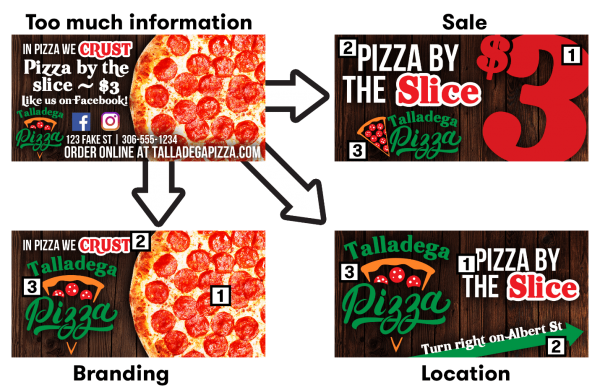
In the above sample, the first ad contains too much information for a viewer to process in 6 seconds. Instead, we can take these messages and break them up into multiple different creatives; one message for general branding, one to promote their sale & one for promoting their location. This makes a more impactful message to the viewer.
“The billboard is finished, when you no longer can find a single element to remove.”
– Robert Fleege
Things to Consider
In addition to using these 3 basic elements, here are a few other things to keep in mind:
Avoid White Backgrounds
White backgrounds on digital billboards can be very hard on viewers’ eyes, especially at night. Consider a dark background with lighter text; viewers will appreciate it.

Website Addresses are Typically Not Necessary
Most consumers get to a website using a search engine, even if they know your website URL. Adding your URL to a billboard uses valuable real estate that can be used for your key message.
Your Message Should be Under 10 Words
Messages need to be clear, quick and to-the-point. Save your detailed descriptions, lists of services, phone numbers, etc. for your website, social media accounts and printed material.
Think you still need help? Don’t worry, we’re here for you. Our in-house creative team can help with your campaign from start to finish. We know what will work well on our digital billboards and we can provide the guidance you need for a successful campaign. We can’t wait to work with you!
-Drew Renwick is a Business Support Manager on the Revenue Growth Team & resident billboard nerd at Directwest.